Avoiding Cheap Fireplace Aesthetic Mistakes
Table of Contents
- Why Some Fireplaces Look Expensive and Others Look Cheap
- Mistake 1: Ignoring Room Scale and Proportion
- Mistake 2: Choosing the Wrong Luxury Fireplace Surround Materials
- Mistake 3: Poor Placement and Dead Space Around the Hearth
- Mistake 4: Skipping the Planning Phase and Building Codes
- How to Upgrade a Builder Grade Fireplace Without a Full Remodel
- Fireplace Mantel Styling Tips That Add Instant Visual Weight
- Conclusion: Fixing the Aesthetic Without Overcomplicating the Design
- Frequently Asked Questions
Last Updated: September 10, 2026
Why Some Fireplaces Look Expensive and Others Look Cheap
The difference between a fireplace that anchors a room and one that undermines it rarely comes down to budget. Avoiding cheap fireplace aesthetic mistakes is about proportion, material honesty, and restraint. This guide from Zen Home Fireplaces breaks down the errors that make a hearth read as builder-grade, and how to fix them.
A fireplace is the visual anchor of a living room. When it fails, the whole room feels unfinished, no matter how good the furniture is. Most homeowners assume the fix is a bigger budget. In practice, it's a better eye.
Below are the mistakes that do the most damage, plus the upgrades with the biggest visual return. The throughline: cheap isn't a price point, it's a set of decisions.
Mistake 1: Ignoring Room Scale and Proportion
Scale is the most common reason a fireplace looks wrong. A surround too small for a tall wall creates dead vertical space above it; one too large overwhelms a compact room.
The general rule: the surround should occupy roughly the same visual width as the furniture grouping in front of it. A sofa and two chairs spanning eight feet need a hearth of similar width; if yours is noticeably narrower, the room feels unbalanced.
Proportion matters vertically too. A mantel hung too high leaves an awkward gap; too low crowds the opening. Aim for a few inches above the firebox opening for gas and electric units.
Mistake 2: Choosing the Wrong Luxury Fireplace Surround Materials
Material choice separates a custom look from a catalog look faster than any other decision. The mistake most homeowners make isn't picking the wrong material, it's misunderstanding what makes a material read as cheap: whether it's used honestly.
Here's the distinction: a budget-friendly material is honest, used at the right scale, with a finish that responds to light. A cheap-looking material pretends to be something it isn't, or has a surface so uniform the eye registers it as manufactured. Faux stone mimicking a stacked-ledger profile can look convincing in photos and obviously synthetic in person. The giveaway isn't the price tag, it's the repetition.
Real masonry, honed limestone, and cast concrete all share one quality: their surfaces change as light moves across them. That subtle variation reads as expensive; flat, uniform, high-gloss finishes read as manufactured.
The Visual Markers of a 'Cheap' Look
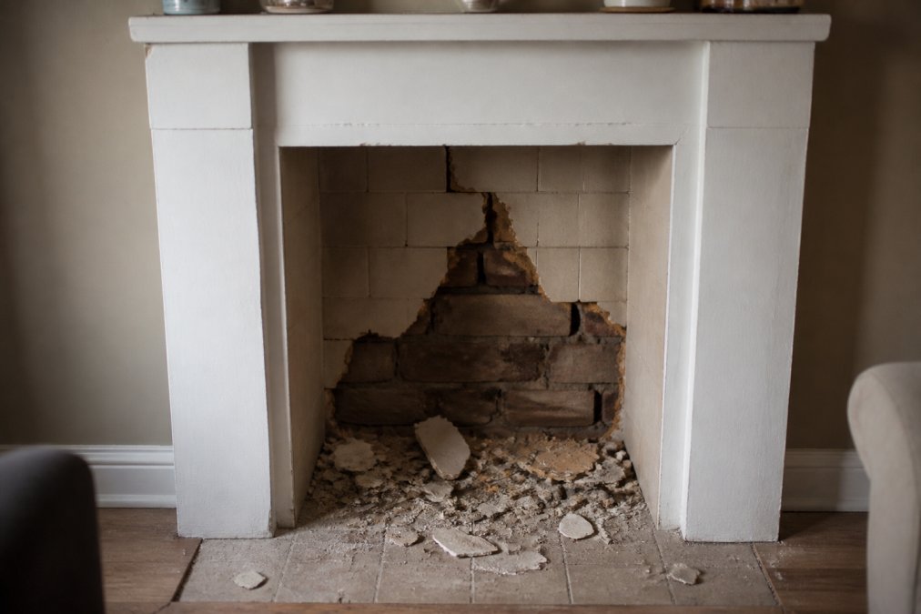
Before you shop, learn the signals that make a surround read as builder-grade, tells that show up in person but disappear in listing photos:
- Repeating pattern seams. Veneer stone and tile printed with a faux-stone pattern repeat the same image every few feet. Real stone never repeats.
- Wide, bright grout lines. Grout lighter than the tile and wider than about 1/8 inch breaks visual continuity and reads as installation-grade rather than custom.
- Glossy finishes on faux materials. High-gloss faux marble reflects light harshly and shows every imperfection beneath it. Real polished stone has depth under the gloss; faux gloss is a flat mirror.
- Thin profiles with visible edges. A surround only 1/4 inch thick at the edge, with substrate visible behind it, reads as a veneer rather than a solid mass.
- Uniform color across the entire surface. Real stone and wood vary in tone. A surround where every tile is the exact same shade reads as manufactured.
Materials That Read as Cheap vs. Materials That Read as Custom
The distinction isn't natural versus synthetic. It's whether the material has depth, texture, and a finish that responds to light.
| Reads as Cheap | Reads as Custom | Why It Matters |
|---|---|---|
| High-gloss faux marble | Honed limestone or soapstone | Gloss shows every flaw and reflects harshly |
| Thin veneer stone with visible seams | Full-depth masonry or cast concrete | Depth creates real shadow lines |
| Painted MDF surround | Solid wood or plaster with a matte finish | Painted MDF reads flat under any light |
| Chrome or polished brass trim | Matte black, bronze, or brushed steel | Polished metals date quickly and glare |
| Tile with wide, bright grout lines | Tight grout lines or dry-stacked stone | Wide grout breaks visual continuity |
| Repeating faux-stone pattern | Natural stone with tonal variation | Repetition signals a manufactured product |
How Light Reflection Changes Perceived Value
Texture and light reflection do more work than color. A matte finish absorbs light and softens a room; a glossy one bounces it back and highlights imperfections. That's why two surrounds at the same price can look a thousand dollars apart.
In most rooms, the primary light source is overhead or from a side window. A matte surface scatters that light into soft gradients; a glossy surface creates a single bright hotspot and a hard reflection line, and every seam, uneven tile, and bit of dust becomes visible.
The same applies to metal trim. Polished chrome and bright brass act like mirrors, doubling every visual flaw. Matte black, oil-rubbed bronze, and brushed steel absorb light and recede, letting the surround be the focal point.
If you're choosing between two options at a similar price, pick the one with more surface variation and less sheen. That does more for perceived value than upgrading to a pricier material with a glossy finish.
guidance on hearth and surround clearances from the National Fire Protection Association
Mistake 3: Poor Placement and Dead Space Around the Hearth
Placement errors are the hardest to fix later, so they deserve the most thought upfront. A fireplace shoved into a corner, or centered on a wall too short to hold it, will always look like an afterthought.
Dead space is the culprit, the area around and above the hearth that sits empty and unstyled, where cheap fireplaces give themselves away. The fix isn't more objects. It's to give the space a job.
The Four Zones of Hearth Styling
Think of the area around your fireplace as four zones, each with a purpose. Most homeowners style only the mantel and leave the other three empty, which makes a hearth feel unfinished.
Zone 1: Above the mantel. The vertical space between the mantel shelf and ceiling. One large piece or a tight grouping, never a scattered row of small items. A single oversized mirror or large-scale art anchors this zone. If the surround is narrow, a tall mirror balances proportions and draws the eye upward.
Zone 2: The mantel shelf itself. Three to five objects grouped with clear hierarchy. Anchor with one large piece, add height on one side, balance with a lower element opposite to create a diagonal line. Leave negative space so the grouping can breathe.
Zone 3: Beside the hearth. The most neglected zone. A tall plant, a stack of firewood, or a floor lantern anchors the vertical line and grounds the fireplace. Without something here, the hearth floats on the wall. A basket of throws, a sculptural floor lamp, or a large ceramic vessel all work. The goal is visual weight, not clutter.
Zone 4: On the hearth itself. Keep it nearly bare. A screen and one object is enough. The hearth surface is a stage, not a shelf, too many objects make the fireplace look like a retail display.
Hiding Technology Without Hiding the Fireplace
Modern fireplaces increasingly come with remotes, app controls, LED flame effects, and thermostat integration. The aesthetic problem: all this technology arrives with visible wires, outdated control panels, and wall-mounted switches that date a room instantly.
A few practical fixes:
- Route cords behind the wall. For electric fireplaces, a recessed outlet behind the unit eliminates the visible cord. If you can't add an outlet, a cord cover painted to match the wall is next best.
- Replace the wall switch with a smart switch. A modern dimmer or smart switch in a matte finish looks intentional; a builder-grade white toggle switch does not.
- Hide the remote. A small tray or box on the mantel or in a nearby drawer keeps remotes out of sight without losing access.
- Choose models with integrated controls. Touch controls on the unit itself, or app-only control, avoid the wall-panel problem entirely.
- Match the flame color to the room. Adjustable flame color and brightness let the glow shift with the room's mood and time of day, making the fireplace feel integrated rather than added on.
Placement Mistakes That Are Hard to Undo
Some placement decisions can't be fixed with styling. Watch for these before you commit:
- Centering on a wall that's too short. If the wall is narrower than the furniture grouping, the fireplace will always look cramped. Consider a corner installation or a different wall.
- Placing the fireplace opposite a large window. The competing focal points fight for attention, and the fireplace loses during daylight hours.
- Ignoring traffic flow. A hearth that intrudes into a walkway forces furniture into awkward arrangements no styling can fix.
- Mounting a TV above a working fireplace. Heat damage aside, the black rectangle flattens the focal point and pulls attention from the surround. If you must mount a TV, choose a low-profile art mode or a recessed niche.
The goal across all four zones is visual weight, not clutter. A single well-scaled object reads as more expensive than five small ones, and a hearth styled with intention reads as custom even when the surround is modest.
Mistake 4: Skipping the Planning Phase and Building Codes
Code compliance isn't just a safety requirement, it's an aesthetic one. A surround that ignores clearance requirements will eventually force an awkward, visible compromise: a heat shield bolted on after the fact, a mantel moved higher than intended, or a hearth extension that breaks the floor line.
U.S. building codes set minimum clearances between a firebox and combustible materials, varying by fuel type and appliance. The specifics live in your local jurisdiction's adopted code, so pull the manufacturer's installation manual before finalizing any surround dimensions. That document governs your project more than any design magazine.
Common planning failures that show up visually:
- Choosing a surround depth before confirming the appliance's required clearance
- Forgetting that a gas insert needs ventilation provisions that affect the wall assembly
- Ordering a mantel before checking the minimum height above the firebox
- Skipping the permit, then discovering the finished surround doesn't match the approved plan
Get the manual, get the permit, then design around the numbers. the U.S. Fire Administration's home fire safety resources is a useful starting point for understanding why these clearances exist.
How to Upgrade a Builder Grade Fireplace Without a Full Remodel
You can upgrade a builder grade fireplace without a full remodel by changing three things: the surround finish, the hearth accessories, and the lighting. None require moving gas lines or pulling permits, and together they shift how the entire wall reads.
Start with the surround. A thin tile or painted MDF face can usually be refaced with a matte stone or plaster finish over the existing substrate, far cheaper than a rebuild. Choose texture over sheen.
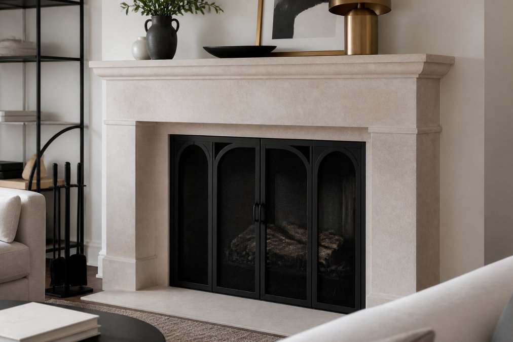
Then address the accessories, where a small spend does the most work. A well-chosen screen changes the firebox's entire silhouette. The Mariella traditional floral iron fireplace screen adds ornate detailing that suits traditional surrounds, while the minimalist single-panel iron screen with diamond design keeps a contemporary wall clean. Both are durable iron and finish the hearth with intention.


Finally, layer the lighting. A pair of wall sconces flanking the mantel, or a picture light above it, gives the surround a reason to catch the eye at night.
Fireplace Mantel Styling Tips That Add Instant Visual Weight
Mantel styling is where most people overcorrect. The instinct is to fill the shelf; the better move is to compose it. Three to five objects grouped with clear hierarchy always outperform a crowded display.
Use this framework:
- Anchor with one large piece such as a mirror, framed art, or a sculptural object
- Add height on one side with a tall candlestick, vase, or stack of books
- Balance with a lower element opposite to create a diagonal line
- Layer in texture with a natural material like wood, linen, or dried branches
- Leave negative space so the grouping can breathe
The same logic applies to a Victorian black fireplace screen or the Lone Star fireplace screen: a single strong accessory does more than several competing ones.

Lighting, Texture, and the Smart Home Integration Angle
Lighting is the most underused tool in fireplace design, and where smart home technology earns its place. Warm, dimmable accent lighting at 2700K flatters stone, wood, and plaster; cool white light flattens them (energy.gov). If your fireplace is electric, look for adjustable flame color and brightness so the glow shifts with the room's mood and time of day.
Texture works the same way. A matte stone surround paired with a soft linen drape and a rough-hewn wood mantel creates depth through contrast. Three smooth surfaces stacked together read as flat and manufactured.
Conclusion: Fixing the Aesthetic Without Overcomplicating the Design
The fireplace mistakes that read as cheap are almost never about money. They're about scale that doesn't fit the room, materials that lie about what they are, and dead space left unstyled. Fix those three, and a modest hearth can look like it belongs in a much more expensive home.
At Zen Home Fireplaces, we offer a curated selection of luxury indoor and outdoor fireplaces, modern electric and gas models, and elegant outdoor living products. Our curated modern designs and the Zen Hearth Essentials line are chosen to work together, so you're not guessing whether the screen, surround, and styling will cohere.
Explore the Zen Home Fireplaces collection and give your hearth the focal point it was always meant to be.
Frequently Asked Questions
What is the most common mistake that makes a fireplace look cheap?
Ignoring scale and proportion is the most frequent mistake. A small firebox on a large wall, or a mantel that is too thin for the room, creates a builder-grade look. The fix is to measure your wall and choose a surround that fills the space with balanced visual weight. A properly scaled fireplace can transform a room, while an undersized one will always look like an afterthought.
Are electric fireplaces considered a cheap aesthetic choice?
Not inherently. A cheap fireplace aesthetic comes from poor design choices, not the heat source. Modern electric models with realistic flame effects and clean lines can look luxurious in condos and apartments. The key is choosing a unit with a well-proportioned surround and avoiding glossy, plastic-looking materials. Pair it with a quality screen and intentional styling, and it will read as high-end.
What materials should I avoid when remodeling a fireplace surround?
Avoid thin, hollow-sounding materials like faux stone panels with visible seams, glossy ceramic tile that mimics marble, and cheap veneers that peel. These read as budget-friendly rather than custom. Instead, choose solid materials with natural texture, such as honed limestone, soapstone, or full-bodied brick with a limewash finish. These materials age well and reflect light in a way that looks expensive.
How can I make a builder-grade fireplace look more expensive without a full remodel?
Start by upgrading the surround with a substantial mantel and a quality fireplace screen. Add a hearth extension in a natural stone or concrete finish. Then style the mantel with a mix of textures and heights, and use warm lighting to highlight the area. These changes cost far less than a rebuild but dramatically improve the visual weight and cohesion of the hearth.